
In 2025, website navigation bar design plays a crucial role in providing an exceptional user experience (UX). As web design evolves, a well-structured and user-friendly navigation bar can make the difference between a smooth browsing experience and a frustrating one. Whether you’re building a business site, blog, or e-commerce store, understanding the key trends and best practices for website navigation bar design is essential.
What is a Website Top Navigation Bar?
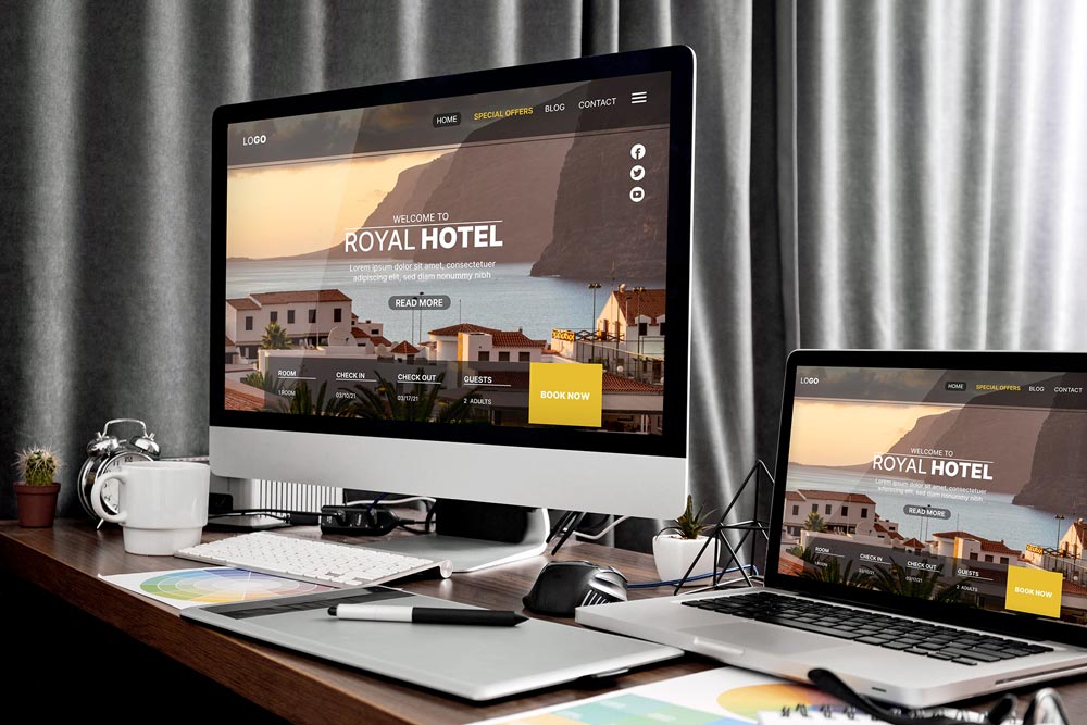
A website navigation bar is the part of a website that allows users to easily navigate between different sections or pages. Typically located at the top or side of the page, it provides links to the most important areas of the site, such as the homepage, services, contact page, or product categories. A well-designed navigation bar can guide users effortlessly through the website, improving overall accessibility and user engagement.
Top Trends in Website Navigation Bar Design for 2025
As design trends continue to evolve, website navigation bar design is increasingly influenced by functionality, simplicity, and mobile optimization. Here are some of the key trends shaping navigation bars in 2025:
- Minimalist Design: Clean and minimalist navigation bars are becoming the norm in 2025. Simple menus with fewer items help reduce cognitive overload and ensure users can easily find what they need without distractions. Less is often more when it comes to effective navigation design.
- Sticky Navigation: Sticky navigation bars that remain at the top of the page as users scroll are gaining popularity. This design ensures that the navigation menu is always accessible, no matter how far the user scrolls, improving usability and engagement.
- Mobile-First Design: With more users accessing websites on mobile devices, website navigation bar design must be mobile-first. Responsive navigation menus that adapt seamlessly to smaller screens, such as hamburger menus or collapsible options, are essential for a great mobile user experience.
- Dropdown and Mega Menus: For websites with a lot of content, dropdown or mega menus are becoming more common. These menus allow you to organize a large number of links into categories, giving users easy access to various sections without overwhelming the navigation bar.
- Integrated Search Bars: Many modern website navigation bar designs now feature integrated search bars. This helps users find specific content quickly and easily, particularly on large websites or e-commerce platforms.
- Personalized Navigation: Personalization is becoming a key trend. Websites are using data to display personalized navigation options, such as showing recommended products or offering language selections based on the user’s location or behavior.
Best Practices for Website Navigation Bar Design
To ensure your website navigation bar design meets modern standards, here are some best practices to follow:
- Prioritize Clarity and Simplicity: Your navigation bar should feature clear, concise labels for each link. Avoid clutter and ensure the most important sections are easily accessible.
- Consistency Across Pages: The navigation bar should remain consistent across all pages of your website. This ensures users always know where to find it and how to navigate, no matter where they are on the site.
- Test for Usability: Continuously test your website navigation bar design with real users to identify pain points and areas for improvement. Collect feedback and make adjustments to ensure it meets the needs of your audience.
- Responsive Design: Ensure your navigation bar looks and functions well on all devices, from desktops to tablets and smartphones. A mobile-friendly design is essential for providing a seamless experience to your users.
- Keep It Visible: Whether it’s through a sticky navigation bar or a fixed header, keeping your navigation menu visible at all times enhances user experience and encourages easy access to different site sections.
- Incorporate Call-to-Action Buttons: Adding strategically placed CTAs, like “Contact Us” or “Shop Now,” within the navigation bar can drive conversions and improve user engagement.
Common Mistakes to Avoid
While website navigation bar design is crucial for the user experience, there are some common mistakes you should avoid:
- Too Many Links: Overloading the navigation bar with links can confuse users and make the site harder to navigate. Stick to the most important sections of the website.
- Poor Mobile Navigation: Failing to optimize your navigation bar for mobile can lead to a frustrating experience for mobile users. Ensure your navigation is responsive and easy to use on all screen sizes.
- Lack of Hierarchy: Without a clear hierarchy in your navigation bar, users might struggle to find relevant content. Use dropdown menus or subcategories to organize related sections.
- Hidden Navigation: While minimalist design is important, completely hiding the navigation bar (for example, through a hidden hamburger menu) can make it hard for users to find what they need. Make sure your navigation bar is easily discoverable.
Conclusion
In 2025, website navigation bar design is more important than ever. A well-designed navigation bar helps users easily access content, improves UX, and supports the overall functionality of the website. By keeping up with modern design trends such as minimalist design, sticky navigation, and mobile-first design, you can create an intuitive and user-friendly navigation system for your website.
Remember to prioritize simplicity, usability, and consistency when designing your navigation bar. Test regularly and optimize it for all devices to ensure that users can navigate your site with ease and enjoy a smooth experience from start to finish.
Check out our blog on homepage layout best practices to ensure your entire site delivers a seamless user experience.